Nav changes
Offcanvas modifications
Bootstrap 5’s navbar can be configured with an offcanvas drawer for navigation. The navbar includes a hamburger-style button to display the navigation menu.
- Bootstrap’s default offcanvas includes a separate button on the canvas to close the menu (most navigation menus use the same button to open and close the menu).
- Bootstrap does not automatically close the menu after a link has been clicked. If the link is to the same page, the user would need to manually close the menu or some JavaScript would need to be added to close the menu.
- Bootstrap does not set focus to the destination for same-page links – focus is returned to the offcanvas button (offcanvas works fine for navigation if all of the links are to different pages).
I modified Bootstrap’s setup to include:
- Using the same toggle button on the navbar to open and close the offcanvas menu:
Bootstrap uses a toggle button on the navbar to open an offcanvas menu and a separate dismiss button on the menu to close it.
To use the navbar button to both open and close the off-canvas menu, I set the button’s z-index to 1050 so that it’s above the off-canvas menu.
I replaced Bootstrap’s static icon with an animated icon to better indicate how to close the off-canvas menu.
- Closing the offcanvas menu when a same-page link is clicked:
To close the menu when a same-page link is clicked, I add a data-bs-dismiss="offcanvas" attribute to the list item. The dismiss data attribute needs to be on the list item rather than the <a> tag as Bootstrap ignores data attributes associated with an <a> tag.
<li class="nav-item" data-bs-dismiss="offcanvas">
    <a class="nav-link" aria-current="page" href="#home">Home<a>
</li>
The data-bs-dismiss="offcanvas" attribute triggers Bootstrap to close the parent offcanvas element.
Note: It would also possible to close the menu using JavaScript by getting the offcanvas instance when a link is clicked. The instance could be used to hide the menu.
- Setting focus to the section a same-page link points to, rather than to the offcanvas toggle button:
When an offcanvas component is closed, Bootstrap’s default action is to return focus to the button that opened the component. This is the default behavior for modals, and offcanvas is based on Bootstrap’s modal. This causes two problems:
- First is that, after the user has selected to move to a different position on the page, the tab position (for using the tab key) will not be associated with the new position. It will, instead, be pointing to the button for opening the menu.
- Second is that on Chromium based browsers (Google Chrome & MS Edge), setting the focus to an element on the page terminates any scroll animations that are in process. Firefox will complete the scroll. (I do not have information on Safari.)
To change what element is focused, I modified the offcanvas JavaScript source file to: 1) include a fourth config value (focus); and 2) move the on-end event handler (EventHandler.one is the function that sets focus to the button that triggered the offcanvas display) from the start of the click handler to the end (after the config values are available) and to not call the on-end event handler if the focus value is set to false.
A simpler method would be to comment out the this.focus() call – the details are provided below.
offcanvas.js changes
I use a custom version of Bootstrap’s offcanvas.js file that’s in the src/js folder. When Webpack builds the bundled JavaScript file, it uses the code from the offcanvas-custom.js file, rather than the offcanvas.js file in the node_modules directory.
The changes include:
- Add a fourth boolean config value,
focusto support adata-bs-focusdata attribute. The default value is true, which cause offcanvas to operate as normal. False cause offcanvas to not restore focus to the calling switch.
const Default = {
    backdrop: true,
    keyboard: true,
    scroll: false,
    focus: true  // Modified: add a fourth value, focus
}

const DefaultType = {
    backdrop: '(boolean|string)',
    keyboard: 'boolean',
    scroll: 'boolean',
    focus: 'boolean'  // Modified: focus is type boolean
}- Move the on-end event handler and only call if needed
The offcanvas on-end event handler sets focus to the button that original triggered showing the offcanvas menu and is currently position near the start of the event handler:
// Current Bootstrap code
EventHandler.on(document, EVENT_CLICK_DATA_API, SELECTOR_DATA_TOGGLE,
    function (event) {
        const target = SelectorEngine.getElementFromSelector(this)

        if (['A', 'AREA'].includes(this.tagName)) {
            event.preventDefault()
        }

        if (isDisabled(this)) {
            return
        }

        EventHandler.one(target, EVENT_HIDDEN, () => {
            // focus on trigger when it is closed
            if (isVisible(this)) {
                this.focus()
            }
        })
Moving the on-end handler to after the data variable gets set to the offcanvas instance makes the config values available.
// Revised code
const data = Offcanvas.getOrCreateInstance(target)
if (data._config.focus) {
    EventHandler.one(target, EVENT_HIDDEN, () => {
        // focus on trigger when it is closed
        if (isVisible(this)) {
            this.focus({ preventScroll: true })
        }
    })
}

data.toggle(this)- Add ARIA expanded attribute to the nav-bar toggler
Bootstrap’s default nav-bar toggler includes an ARIA attribute to indicate if the menu is being displayed (expanded) or not. The offcanvas menu does not include this. These code changes add that function.
toggle(relatedTarget) {
    return this._isShown ?
        this.hide(relatedTarget) :
        this.show(relatedTarget)
}   // Modified: relatedTarget is passed to the hide function


show(relatedTarget) {
        ...
    this._addAria(relatedTarget, true)  // Modified: added call to ARIA
        ...
}

hide(relatedTarget) {
        ...
    this._addAria(relatedTarget, false) // Modified: added call to ARIA
        ...
}

_addAria(element, isOpen) { // Modified: added ARIA function
    if (!element) {
      return
    }

    element.setAttribute('aria-expanded', isOpen)
}
Using data-bs-focus
When there are menu links to the same page, set data-bs-focus to false:
<div class="offcanvas offcanvas-md offcanvas-end flex-grow-1 px-4"
    id="offcanvas-navbar"
    tabindex="-1"
    aria-labelledby="bdNavbarOffcanvasLabel"
    data-bs-focus="false">
</div>
If data-bs-focus is set to false, focus is not restored to the hamburger button, which enables:
- Smooth scroll to the target section completes (on Chromium based browsers)
- The targeted section will have the focus
I submited a pull request to GitHub, but there was limited interest in the change, so I closed the request.
Simpler focus fix
If having the focus function is not needed, the code can be commented out:
EventHandler.one(target, EVENT_HIDDEN, () => {
    // focus on trigger when it is closed
    // Modified - always ignore refocus
    // if (isVisible(this)) {
    //   this.focus()
    // }
})
Note: For a single-page application, it would be best to always show the menu choices, rather than hiding them behind a hamburger-style button, but that’s not always an option due to space limitations.
Nav text alignment
As configured by Bootstrap, the text for the links in the navbar and the text for dropdown menus are off vertically by one pixel.
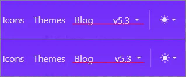
Adding border-0 class to the buttons for dropdowns fixes the alignment.
<div class="nav-item dropdown">
    <button class="btn btn-link nav-link dropdown-toggle border-0"
        type="button" data-bs-toggle="dropdown"
        aria-expanded="false">
        Details
    </button>
    <div class="dropdown-menu dropdown-menu-end slide-in">
        <a class="dropdown-item" href="#">Action</a>
        <a class="dropdown-item" href="#">Another action</a>
        <a class="dropdown-item" href="#">Something else here</a>
    </div>
</div>
Nav button focus styling
Bootstrap’s styling for buttons when focused is to have a shadow around the button. This is different from the default browser styling, which for Firefox is a white and a black line around the button.
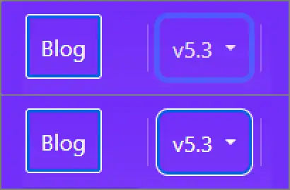
I’ve overridden the Bootstrap styling for buttons in the navbar so the buttons, when they have focus, are highlighted similarly to the other links in the navbar.